Problem
The Homer Fund is a program that financially helps employees in times of need. They need to encourage more donations so that they can help more people. We needed to accommodate users that donate to the site and fundraising captains that submit their earnings from fundraisers.
Why?
Users are simply unaware of the The Homer Fund and its impact. Adjusting donation amounts isn’t very clear and they rarely visit the site.
Solution
Streamline donation to make donation easier. Increase the awareness of The Homer Fund and their impact. This will enable users to increase donations.
My Role -
User Testing
Heuristic Analysis
Lostness Calculations
Information Architecture
Challenges -
Three week sprint
No access to the internal portals
No access to store employees
No access to The Homer Fund Team
Click to Enlarge
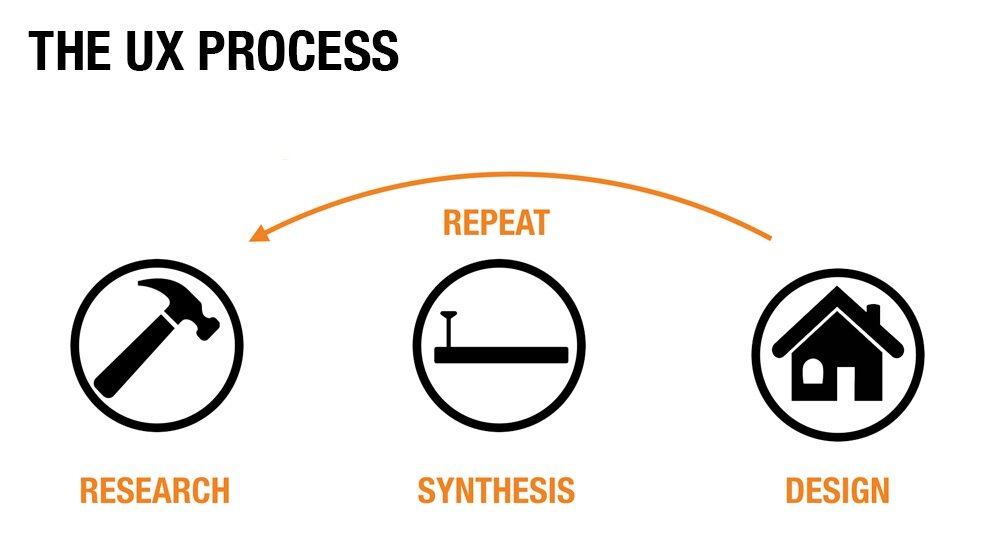
RESEARCH
Click to Enlarge
Click to Enlarge
Click to Enlarge
Click to Enlarge
HEURISTIC ANALYSIS FINDINGS
We found that Donations needs to be more clear and prominent
The entire site felt clunky, redundant and needs to be simplified
TASK ANALYSIS - 5 USERS
Due to our limitations and accessibilities to Home Depot employees we proceeded to do a Task Analysis on 5 people outside The Home Depot.
We gave them the following tasks:
Task1: Find out who is being helped by the money this non-profit raises.
Task 2: Find where to go if you were an employee and wanted to donate based on your payroll.
Task 3: You are a fundraising captain who wants to submit the funds you’ve collected through a fundraiser. For example, a bake sale. Where would you find information about turning in your funds?
Fun Fact: When we were doing our Heuristic Analysis we found that “Donation” did not take you to the Donation Page but just the Donate via Checking page. I noted this as something to address.
SYNTHESIS
LOSTNESS ANALYSIS
When we were doing our Task Analysis we also took into account that we wanted to run a Lostness Analysis. Which means we counted the clicks and how the user would navigate the site and used the number of clicks and compare it to the quickest route to take. We initially based it on the default route but found we needed to base our calculations on a different route. There was a discovery made that we had to re-calculate how we were counting the clicks when it came to looking into setting up an automatic donation (Task 2).
The current default route…
Click to Enlarge
What one of our testers did…
Click to Enlarge
Task1: Find out who is being helped by the money this non-profit raises.
Task 2: Find where to go if you were an employee and wanted to donate based on your payroll.
Task 3: You are a fundraising captain who wants to submit the funds you’ve collected through a fundraiser.
Lostness Results
We took the clicks we’ve counted and plugged it into the formula based on the more direct path (which was the path one of our users found). The lower the score the less lost our user was in completing the task.
After recalculating our clicks on the more direct route pointed out by our user, we averaged the 5 scores and came across these results.
Based on this there was real difficulty with Task 3 which was turning in funds as a fund raising captain. One of the testers had to resort to using the search feature to find anything on it.
Our affinity map seemed to support this notion as well as provided some other weak points the site currently has…
Affinity Map of Task Analysis
Task 1 -
Find who is being helped by The Homer Fund
Takeaways:
Uncertain on who needs to be helped
Have that information immediately on the home page
Task 2 -
Make a Payroll Donation
Takeaways:
Issues with navigation and layout
Navigation is unclear and confusing
Mixed results
Perceived errors
( when the user clicked “automatic payroll donation” it pointed out you needed access to MyApron to proceed. In my opinion this button should not be available to the public. )
Task 3 -
As a Captain, ind where to turn in funds
Takeaways:
Should be easier to find information on Captains
Labeling and terms are unclear
DESIGN
With the information gathered I proceeded to look into the sitemap and user flows. Mainly simplifying things to make it easier on the user so that they can find what they need in a timely manner.
Click to Enlarge
Click to Enlarge
Click to Enlarge
Click to Enlarge
SOLUTIONS
My team did User Interviews which revealed a few critical things. They too had trouble navigating the site to either figure out where to go and were not aware how to go about adjusting their current automatic payroll donation. Users wanted to know more about the impact and stories of how The Homer Fund helps their fellow employees. Most importantly they pointed out they rarely visit the site. Due to the limited accessibility we were able to interview them late in the process.
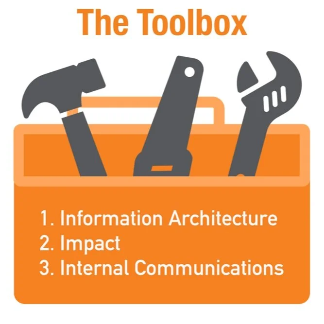
After much discussion we came up with our solution to address these newly discovered information. We called it the Toolbox.
Information Architecture -
New Web Design
I worked closely with the Designer who was working on the prototype for how the new web site would work. To ensure that things were consistent with the new sitemap and the userflow.
The Designer did a user test with some employees of The Home Depot. She got some feedback and applied changes based on that feedback did a second iteration (as portrayed in the video). She did another Lostness Analysis and it all came to 0 on all tasks which in turn meant users have no trouble completing the tasks with the new sitemap, userflows and the new web design prototype.
Impact
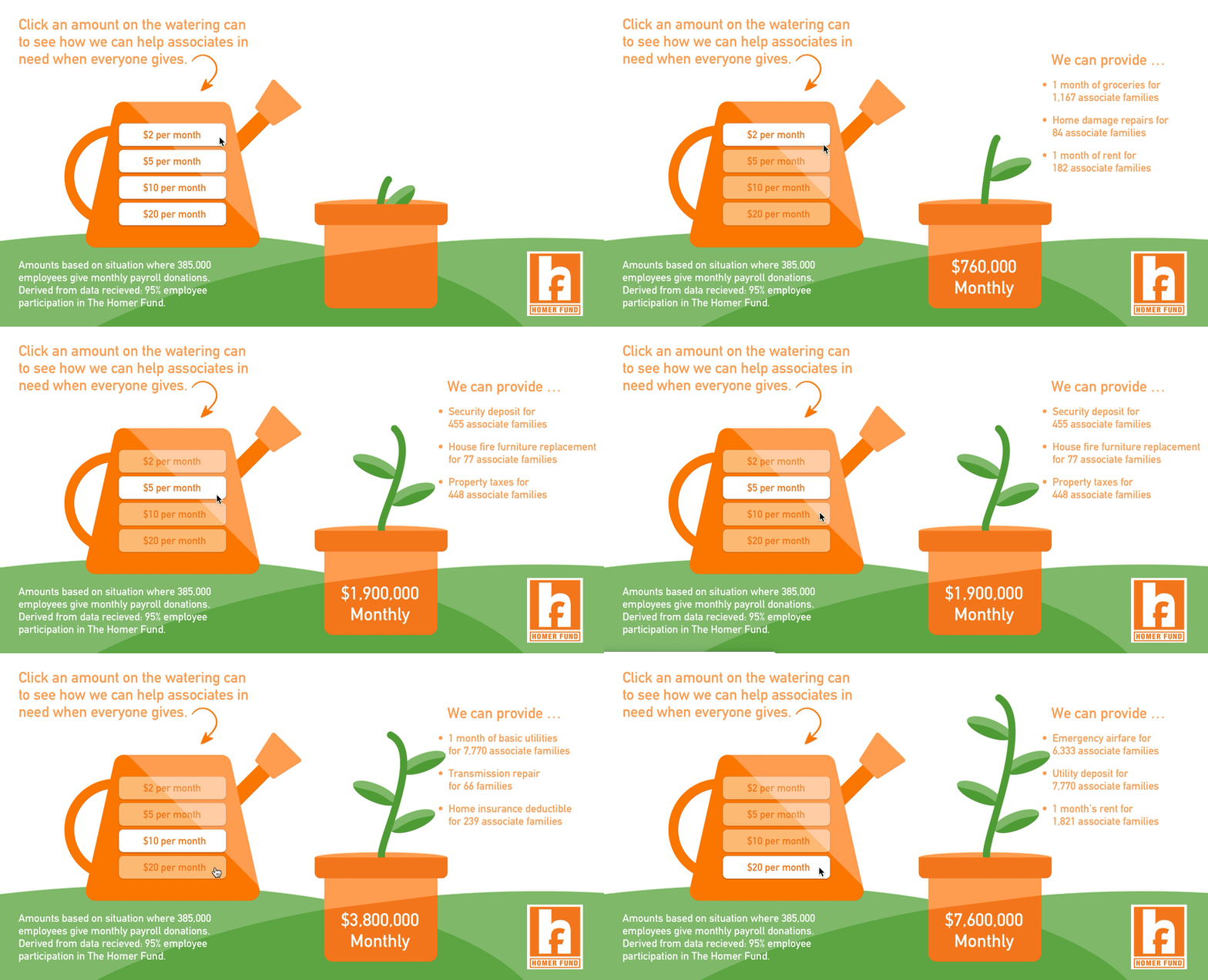
Interactive Calculator
This shows how much of an impact on other employees one would have when they change the amount of their current donation.
Internal Communications
Call to Action, Why I Donate
There needed to be a way to drive people to the site. So we’ve come up with with the suggestion that The Homer Fund could use a call to action to encourage more visits, personalized, generic and at times when specific events occur. The users wanted to get to know the stories behind those that have been supported and we suggested to role with “Why I Donate” a way for people who want to tell their story to enter their story right away. Ideally these would be used in email communications or in Slack integration.


